Design agency York header image

Design agency in York

Castlegate’s graphic design expertise is not restricted to web: we also offer a complete branding and identity graphic design service.

Through our brand discovery process, we work closely with your organisation to build your brand identity from the ground up. We employ a range of activities and exercises to quickly discover where your brand is now, where you would like to take it, and how we will get it there. One client described the process as ‘hard fun’.

We research your company, your industry and your competitors to make sure the solutions we offer are the right fit. We like to problem-solve first, design second.

Accessible Branding and Design graphic

Accessible Branding and Design

Having achieved certification from the Creative Boost Academy Accessible Branding and Design course, we know how important accessibility is. It is one of the key areas we focus on when creating our work, including the design of our identities.

The choice of typography and colours play a huge role in defining your business and setting it apart. An accessible design ensures the desired information is communicated to the largest possible audience in the most user-friendly way.

Accessibility should be considered from the outset of any design project. It is important because an accessible design leads to a better user experience, higher conversation rates, and an increased return on investment for the client.


design agency in york

Asking the right questions

We aim to understand the nuances of each of our client’s businesses to deliver eye-catching design and branding solutions that reflect their core values.

An example of high end logo design visualised on a tin

Bring your branding to life

We can carry out all aspects of branding and design work for your company; including logos, business cards and brochures. We build websites around your company’s branding to create a cohesive visual identity.

High end logo design for local government visualisation

Air Quality Hub

We worked with the City of York Council to develop a brand identity and web portal for the Air Quality Hub, a DEFRA-funded project to help local authorities to improve air quality by providing them with resources and guidance.

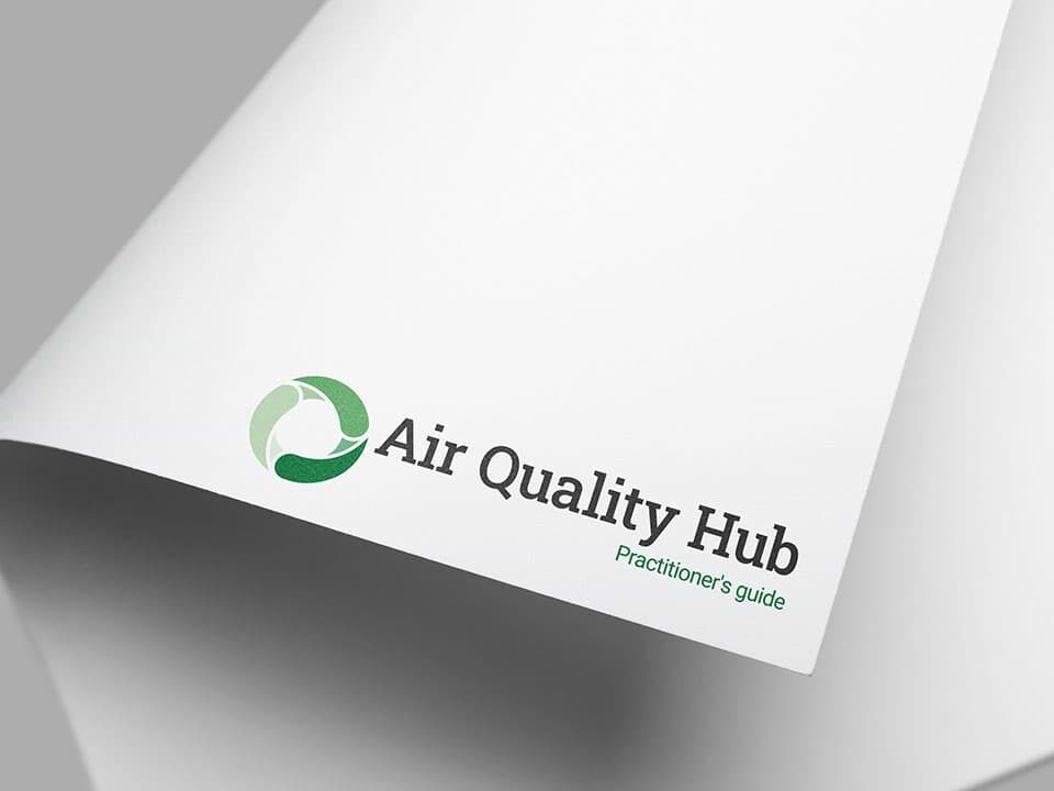
We designed a logo depicting three rotating blades of a fan. The gradual transition in the shade of the fan blades evokes movement, progress, and the step-by-step process of implementing clean air strategies.

The site itself is highly specified and feature-packed. We developed an uncluttered visual design for the site so that these features are presented in a clear, concise and intuitive way.

Learn more about the Air Quality Hub


graphic designer in York

The Pyrenees Cycling Tour Company

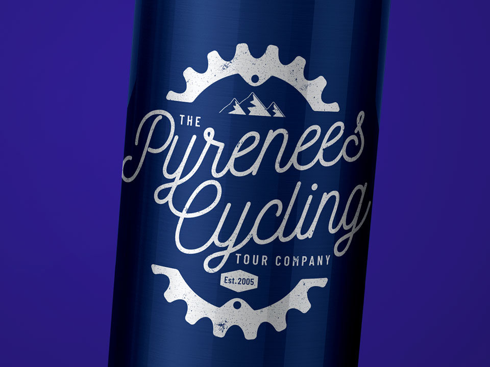
Influenced by the winding roads of the Pyrenees, a cursive script is used to evoke the feeling of freedom and an independent spirit. The design balances a modern feel with an authentic rustic style to create a brand mark with authority that can be trusted.

Learn more about The Pyrenees Cycling Tour Company

branding design York

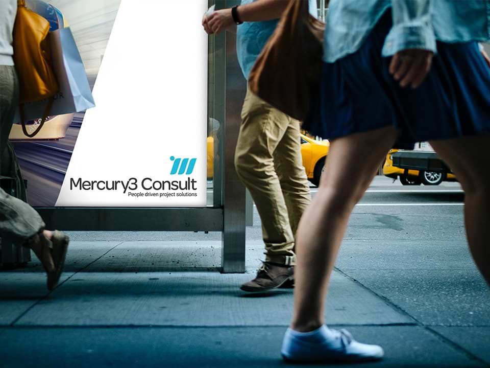
Mercury3 Consult

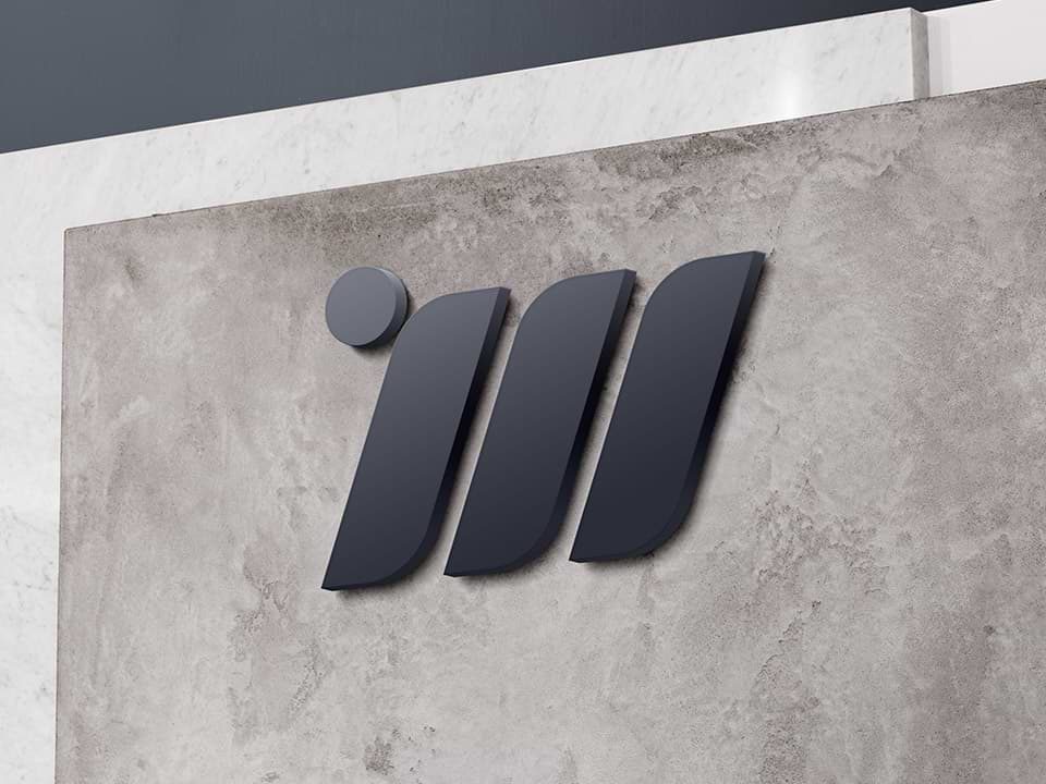
Mercury3 Consult specialise in project management and programme delivery within the transport, utility and chemical industry. We provided a full branding and logo design service for the company alongside building their new website. We developed a distinctive logo based on the M and 3 from the company’s name, and built a website with a cohesive brand identity that reflected the prestige and professionalism of Mercury3 Consult.

Learn more about Mercury3 Consult

An example of high end construction logo design

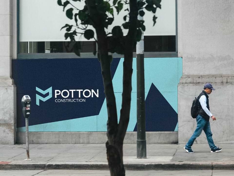
Potton Construction

We were asked to develop a new logo and website for local construction and planning company Potton Construction. We came up with a distinctive and memorable lettermark, using the P from Potton to create the impression of a 3D structure. The new logo plays an essential role in consolidating Potton’s brand identity, and it now takes pride of place on company vehicles, clothing, and, of course, their website.

Learn more about Potton Construction

An example of high end non profit logo design

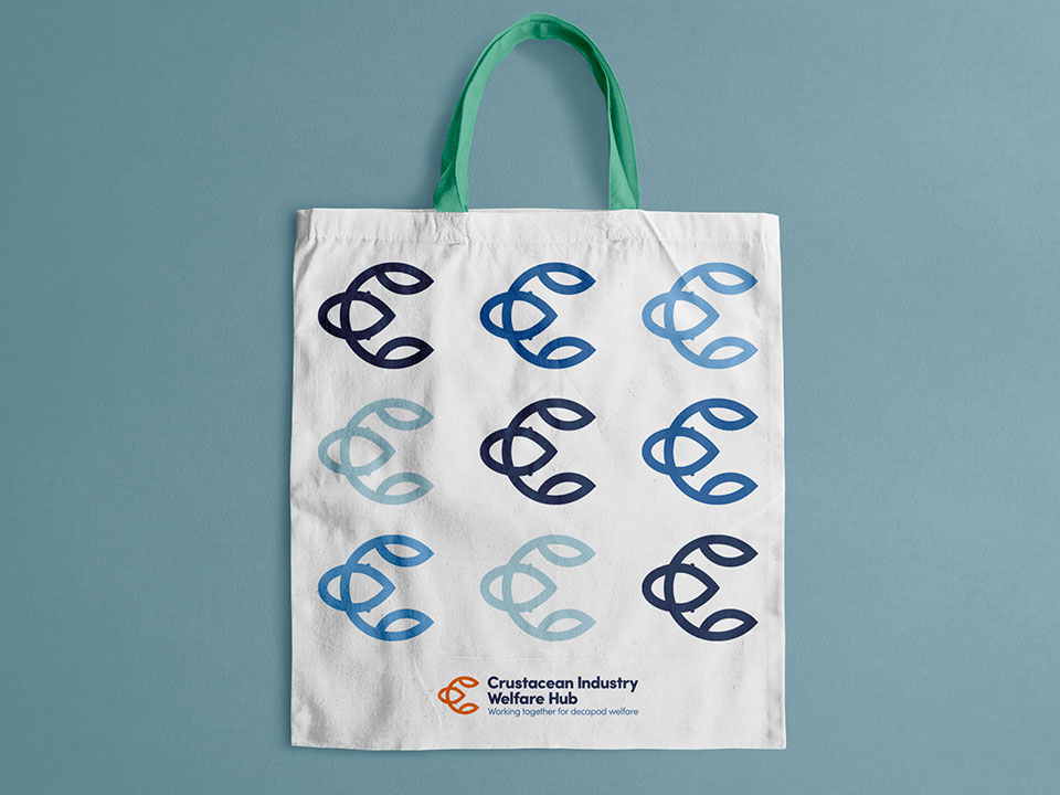
Crustacean Industry Welfare Hub

We crafted a fresh and distinctive brand identity for the Crustacean Industry Welfare Hub, an initiative that exists to improve welfare standards for crustaceans in seafood supply chains. As well as developing a name and tagline for the group, we also designed them a playful logo by fusing the form of a lobster with the letter ‘C’. The brand aesthetic, which was rolled out over their new website, is clean with rebellious elements, using a wave contour to break up hard lines, and splashes of orange to enliven a palette of seaside shades.

Learn more about Crustacean Industry Welfare Hub

An example of high end charity design logo design

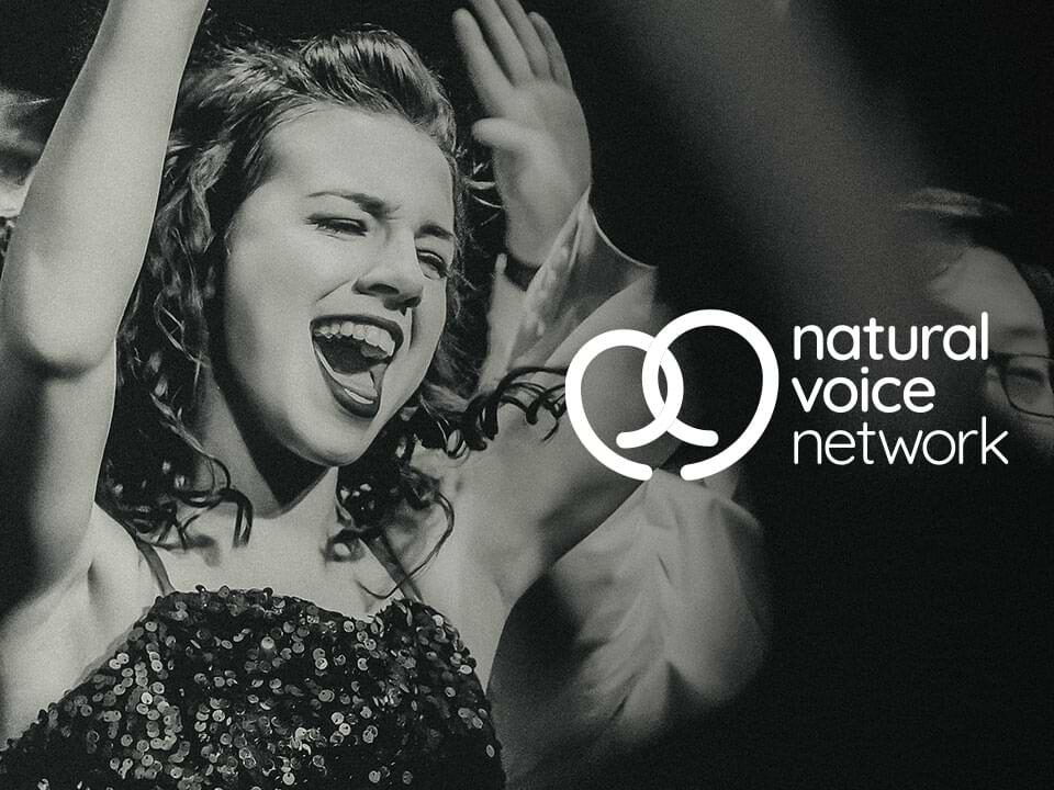
Natural Voice Network

Natural Voice Network, a collective who believe in the importance of song to community, wanted to modernise their logo to attract new members. The existing logo, with its dynamic arcs and warm colours, was central Natural Voice Network’s brand. Preserving the essence of the original, we smoothed the lines and interlinked the arcs to convey the NVN’s network of communities. We chose a typeface which complemented the logo’s curves, communicating the friendly, inviting community that NVN offers.

Learn more about Natural Voice Network

Cabinlocator

We were asked to produce a new logo and website for portable building suppliers Cabinlocator. The company makes it easy to find the perfect portable building for any application – so we designed a logo based around the concept of searching that combined the shape of a magnifying glass with the C from Cabinlocator. The result is a simple yet distinctive brand mark that remains recognisable at all sizes.

Learn more about Cabinlocator

CVS

Simplicity and conciseness were the goal when designing a new logo for CVS. The company provides vehicle leasing services to people who might struggle to get approved by other companies. To emphasize the idea of approval, we combined a tick symbol with the company’s initials. The result is a straightforward, scalable logo that underscores the brand’s identity.

Learn more about CVS

An example of high end logo design visualised on a flag

G-Hire

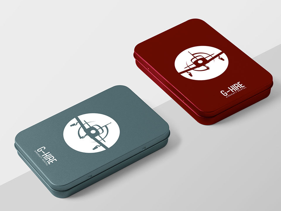
G-Hire approached Castlegate in need of a new website, complete with new logo design and original branding. Our first step was to design the new logo for G-Hire: the distinctive design is based on the Piper PA-28 Cherokee, one of the popular planes that G-Hire provide. The typeface for the company name was chosen to evoke the glamour of air transport.

Learn more about G-Hire

An example of high end charity logo design

Open Doors Education & Training

Open Doors Education & Training provides tablets, wifi dongles and one-to-one tuition to young people from ethnic minority backgrounds. Alongside a new website, we designed a memorable logo based on the image of a key and a “power” symbol: the key symbolises the opening of doors and the unlocking of new opportunities, while the power symbol represents the important role that technology plays in ODET’s work.

Find out more about ODET

logo design York

Jollydays

Founded in 2008, Jollydays was at the forefront of the UK’s glamping revolution. We built a new website for Jollydays to communicate their unique company to prospective customers in a clear and eye-catching way. Using the industry-leading WordPress platform, we carefully designed and built a responsive website that could be easily used on any device, with prominent booking links and calls to action. Straightforward navigation and a simple enquiry form make it easy for site visitors to easily find the information they need and get in touch.

Find out more about Jollydays Glamping

branding consultant York

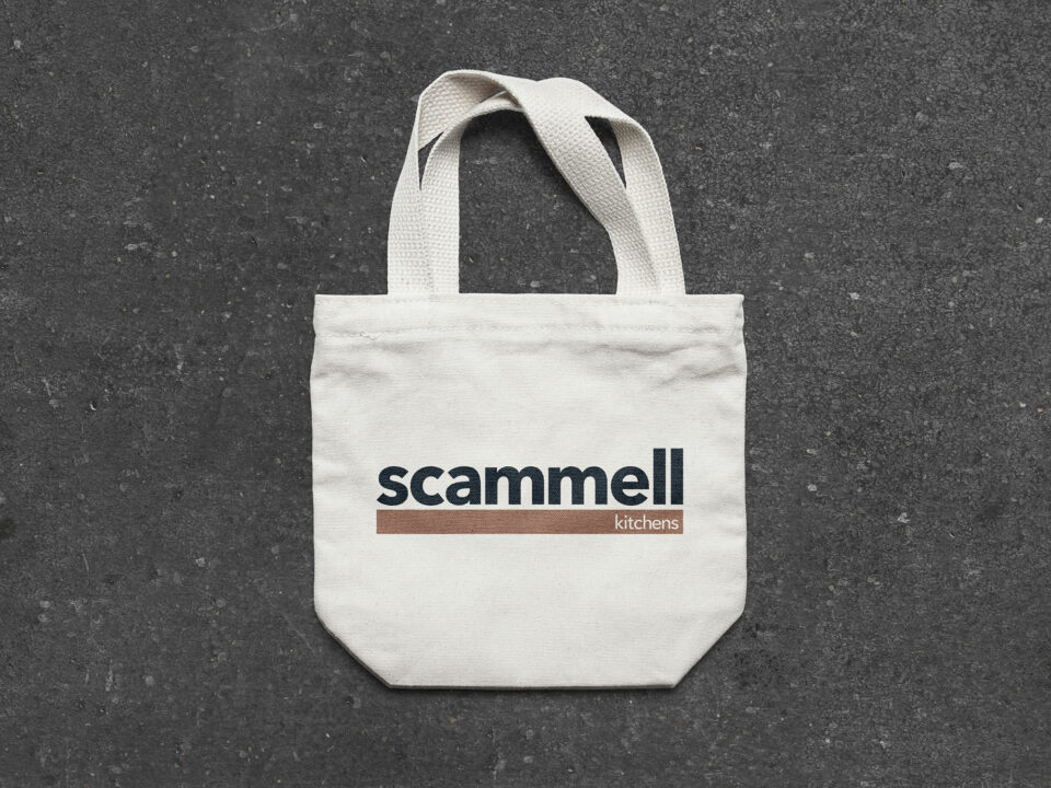
Scammell Kitchens

Scammell Kitchens approached Castlegate in need of a brand refresh to better reflect the quality of the luxury kitchens they produce. The team at Scammell also needed a new high-quality website which would allow them to showcase the best of their work.

Early in the design process we agreed to modify the wording from ‘Scammell Interiors’ to ‘Scammell Kitchens’ to better reflect the core offering. We chose a sophisticated typeface and colour palette which were used to inform the website design. Bespoke photography of the team and their work was commissioned, and we used this to build a strongly image-lead website which immediately shows off Scammell’s excellent work to site visitors.

Learn more about Scammell Kitchens

Designer York

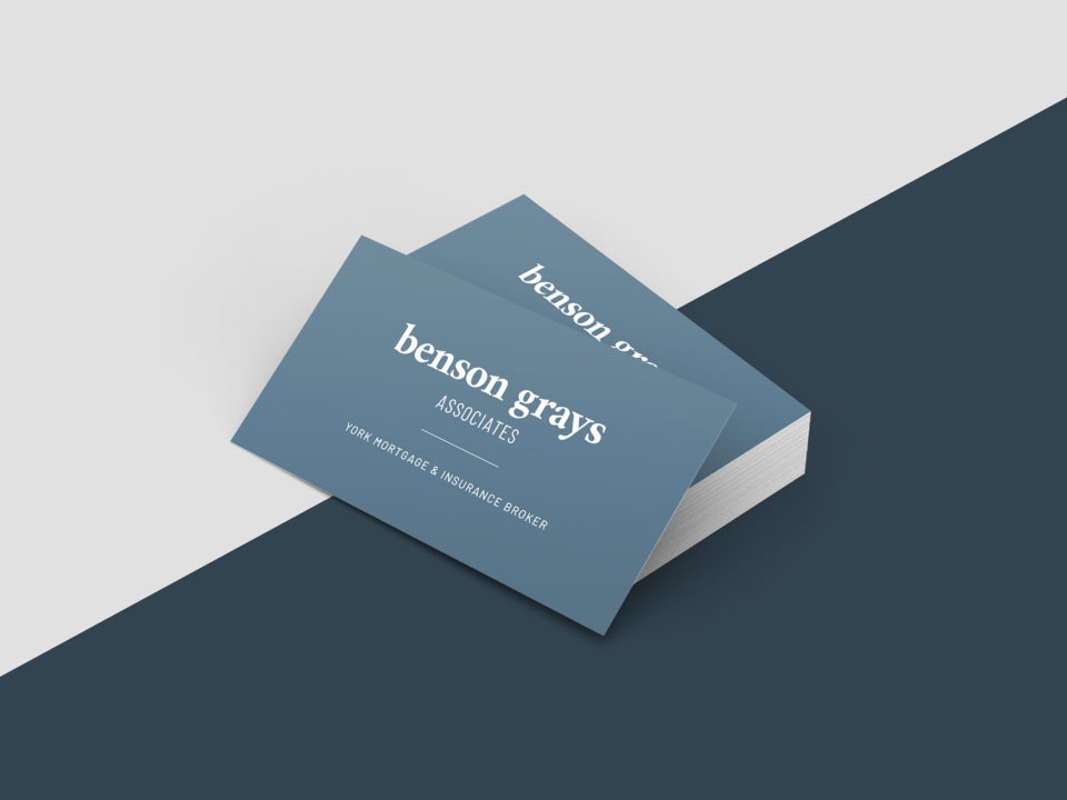
Benson Grays Associates

Mortgage brokerage Benson Grays Associates asked us to produce a new brand identity and website for them. We carefully built the branding around the key values of Benson Grays: approachability and professionalism. We chose a clean serif font for the typeface to give a modern feel, using lower-case to convey approachability. We offset this against a blue-grey background to reinforce an impression of reliability and responsibility.

We built a simple one-page website to clearly present the firm online, with clear calls to action to provide a straightforward process for prospective clients to get in touch.

Learn more about Benson Grays Associates

design agency York

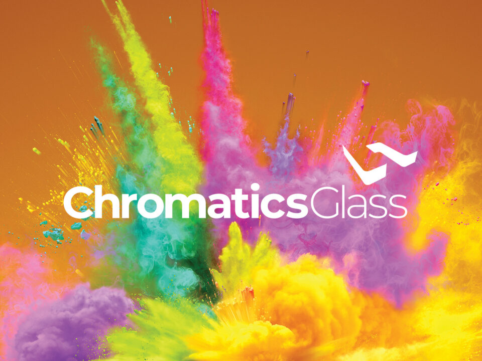
Chromatics Glass

We recently worked on a complete rebrand for safety glass manufacturer Chromatics Glass. We went through a ‘brand discovery’ process with Chromatics to determine their target market and key demographics to inform the design of their branding. We designed a memorable logo which is simple enough to be used in smaller sizes on branded products, but striking enough to be used for larger applications such as stand graphics.

We also built a bespoke website for Chromatics, adapting the curved elements of the logo and using these to inform the website design. In addition to the logo and website, we produced new business cards and printed brochures for the company, designed around a striking powder-paint explosion image.

Learn more about Chromatics Glass

Get in touch and let’s discuss how we can help