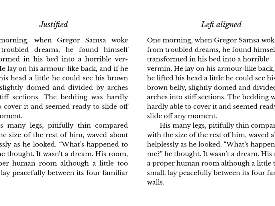
Can justified text be justified for the web?
Can justified text be justified for the web? The answer, in case you were wondering, is no! As you continue to read this article I will explain the disadvantages of justified text, and when it should be used. To begin, I would like to explain my reasons for writing this blog post.
In the past we’ve had several clients say:
That text would look much neater justified, can you change it please?
In most cases we’ve successfully explained the pitfalls of justified text and the client has agreed to keep the standard left alignment. However, in some cases, clients had decided to have justified text regardless.
What is justified text and when is it used?
Justified text or justification, in typography, is the alignment of text within a column or measure to align against the left and right margin. To achieve this effect, extra space is added between words. Justified text is commonly used in printed media such as newspapers, book, leaflets etc where the straight line on each margin can be used successfully to guide the eye across columns of text.
Newspapers are a great example of justified text used successfully. With such a large amount of information to place on a large area, the neatly aligned columns clearly define the different areas of text and create a logical flow of words, thus enhancing readability.
Why is justified text on websites a bad idea?
There are many reasons why not to use justified text and they revolve around usability and user experience.
The human eye perceives images on a screen different to that of printed media so its understandable that justified text can work, but not necessarily on a computer screen. You may not be aware but the image on a screen is not static, in fact its updated and refreshed many times a second. Reading on a computer screen is much harder on the eyes than reading from printed media.
Here are the top reasons why justified text is a bad idea for websites
- When using justified text for print, the designer has complete control over how the user will see the content. However, with the many combination of website browsers (and versions) on many different operating systems, a website designer can not be certain how the justified text will be rendered on the screen. For example a person using Firefox 3 browser on a Mac, would likely see the text displayed differently to somebody using Internet Explorer 6 on Windows XP.
- The different rendering on different systems can create “rivers” of white space. This is when the spaces between words line up with other lines of text, creating a column of space down the content. This river within the text draws the eye away from the content making it more difficult to read. In some cases the white space can form more of a logical pattern than the content itself.
- A combination of the first two points make justified text difficult to read by dyslexic users. The uneven white space creates a distraction which can easily make you lose your place. As web designers we spend time testing in different browsers to make sure as many people as possible can view the website as intended. Around 10% of the UK population are affected by dyslexia to some degree, so making a website that is difficult for 10% of users to read is obviously a bad idea!
- Visually impaired users often use screen magnifiers to enlarge text to a suitable level. Many magnifiers work by enlarging the area around your mouse. Because the large uneven spaces are also magnified it can become difficult for the to follow the words with their magnifying software. Instead of following the flow of words along even spacing, users have to find the start of each new word.
- The Royal National Institute of Blind people (RNIB) strongly recommend websites do not use justified text. Modern websites are all about the user. There was a time websites were created to look good on the creators screen, not necessarily other users. Websites we not tested thoroughly to make sure all users can access the content. Times have changed and accessibility and usability are very important factors in modern website development. Doing anything that excludes or hinders certain users, reduces the audience and therefore the overall success of a website.


